We here at BuildDirect are honored to have our first of hopefully many guest blog posts right here on this humble blog of ours.
Today’s guest post is by Dan Gregory, Editor-in-Chief of houseplans.com, a sales and resource site for property owners, decorators, and builders looking to build a home from the ground up. Houseplans.com source house plans from respected architects from all over the United States and have been doing so since 1946.
***
It pays to look down when you enter a room, not only to see where you’re going but also to appreciate how floors can establish an interior’s character and patterns of use. Think honey-toned wood for casual warmth; darker wood for greater formality; stone for a rustic look; ceramic tile for something in-between that’s also water resistant.
And don’t forget the potential for a floor’s ornamental features, or how changes in materials — from wood to stone, for example — can help define key spots within a larger space or separate circulation areas like hallways from destination zones like the great room or kitchen. Here are some historical and contemporary “floor samples” to inspire your own installations.
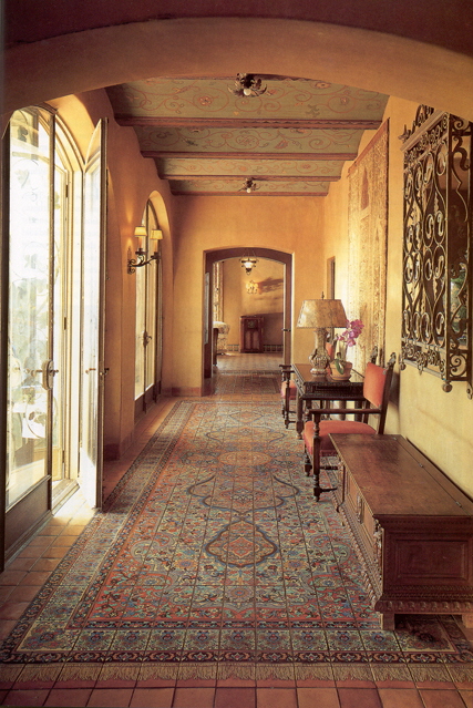
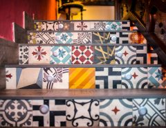
A magic carpet of ornamental tile furnishes the entry hall in the Adamson house at Malibu. Now a California state park. The house was built in 1930 by the owners of the Malibu Tile Company as a tile showcase.
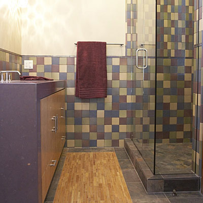
A recent variation on the permanent area rug idea is this “bamboo runner” set into a floor of slate tile in a contemporary bathroom.
It’s from Sunset Magazine’s Monterey Bay Idea House, designed by architect Thomas Bateman Hood with Joseph Hittinger Interior Design.
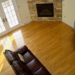
What could be warmer than this wood floor in the dining area of a house designed by Turnbull, Griffin, Haesloop Architects?
It catches and reflects the light, making the room glow.
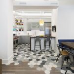
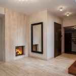
A dramatic transition between main living area and hallway is achieved by contrasting stone and wood, as shown here in Sunset‘s Tahoe Idea House by Faulkner Architects with Spirit Interior Design.
Or, here’s an example from our Plan 449-9.
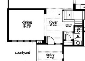
The foyer floor is stone, while the adjacent dining room has a wood floor. The change in material between foyer and dining room separates the two spaces without confining either one — so both feel expansive.

The master bath and dressing area in this house take a similar approach: the wood floor changes to tile for the raised tub and shower platform.
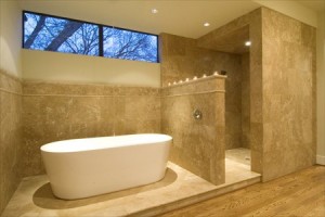
The change in material (and level) is practical and esthetic, helping to set off the bathing area as a special wet zone within a larger space.
Painting a floor is another way to go. In the following example, the geometric pattern is both formal and warm. And it leads the eye into the next room.
But you get the idea: floors aren’t just for walking! Find the floor that fits the way you want to live.
***
Dan Gregory is a respected voice when it comes to design trends in the house building industry. He authors his own blog on houseplans.com, Eye on Design by Dan Gregory.
You can also follow Houseplans.com on Twitter.
Thanks for your post here, Dan.
Cheers,
Rob


